Pipeline forecasting
Designing an experience that gives sales leaders real-time visibility into team quotas and clear actions to help teams hit their numbers.
Overview
Bridging the gap between prospecting and deal management.
Outreach, a platform historically focused on sales prospecting workflows, faced a significant challenge. While the company had traditionally supported sales reps with prospecting tasks (cold calling, emailing, scheduling meetings), there was a new initiative to support deal management (prioritizing, tracking, and monitoring deals in the pipeline). However, these two critical aspects of the sales process were managed in isolation, which hindered the overall efficiency of our users.
Selling a vision
Conceptual designs
Recognizing the need for a holistic solution, I collaborated with product management and other designers to envision a new feature. This feature envisioned a "sales pipeline funnel" calculator that would use historical data and AI algorithms to project the number of deals won for a given quarter. This innovation aimed to help sales managers estimate the additional prospecting efforts required to meet their sales quotas.
These early designs were shared with the entire Product-Design-Engineering (PDE) organization and directly with the Chief Product Officer (CPO) to gather preliminary feedback and generate excitement around the concept.
Selling a vision
Convincing stakeholders to spend time on discovery work
Product leadership at Outreach was enthusiastic about the project, eager to start development as soon as possible. However, little validation had been conducted to ensure the design met user expectations. Furthermore, no plans existed for integrating this feature into the existing ecosystem.
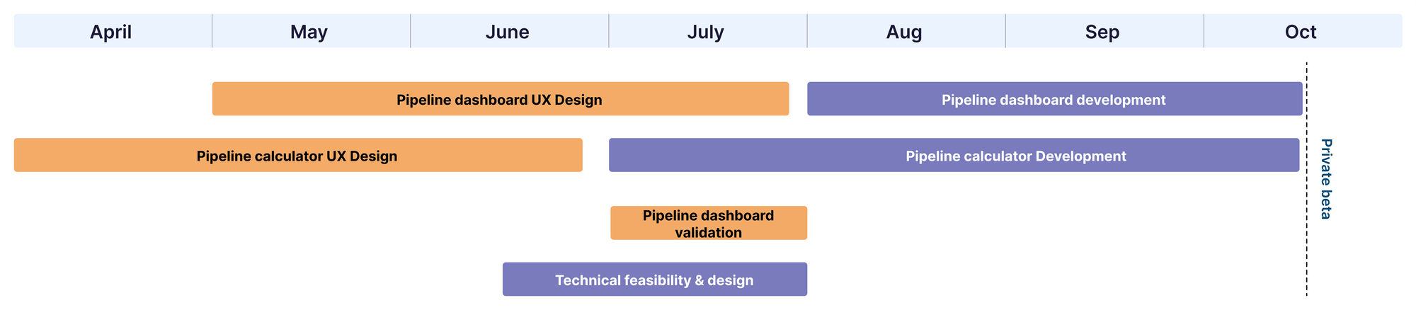
To address these concerns, I collaborated with Product Management, Engineering, and Data Science to create a project timeline. This timeline allowed for Engineering and Data Science work to be completed a month before the annual sales conference, which was the target for beta readiness. It also incorporated time for discovery and evaluative research.
Cross-functional collaboration
Figuring out where this concept should live
In collaboration with my Product Manager, I explored synergies with another product vertical known as Deal Intelligence. This team was planning to create a Deal Insights dashboard for sales managers, which appeared to be a suitable home for our new feature. However, since my team was ahead in terms of development, we faced questions about how the new dashboard would look and function and how our feature would fit. To provide the Deal Intelligence team time to catch up, I initiated the discovery research phase.
Discovery research
Main insights from talking to sales managers
To gain deeper insights, I engaged with three customers and three internal sales managers. Their goal was to understand current workflows, tools, and behaviors. Four main insights emerged from this research:
Design requirements
After defining the top takeaways from the research, I crafted the design requirements I wanted to keep in mind when designing this new experience:
- Move away from funnel visualization to represent sales stages more accurately.
- Shift the focus towards pipeline creation rather than the full create-to-close funnel.
- Highlight the relationship between work in one quarter and its impact on an upcoming quarter.
- De-emphasize the calculator and focus on pipeline creation recommendations and impact.
First iterations
Large card on the dashboard
The initial design iteration made some assumptions about the upcoming Deal Insights dashboard. It featured tabs for different sales quarters, with the current quarter marked as "active." Users could view up to three quarters into the future, with a countdown to the next quarter. Recommendations for increasing pipeline via prospecting were provided.
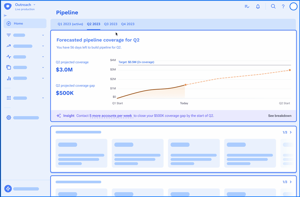
Drill down to reveal insights
A drilldown option allowed users to toggle between their current trajectory and the recommended trajectory, with a visual connection showing the relationship between the number of accounts contacted and pipeline created.
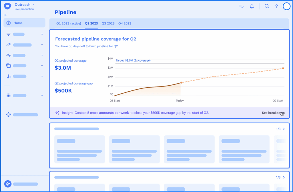
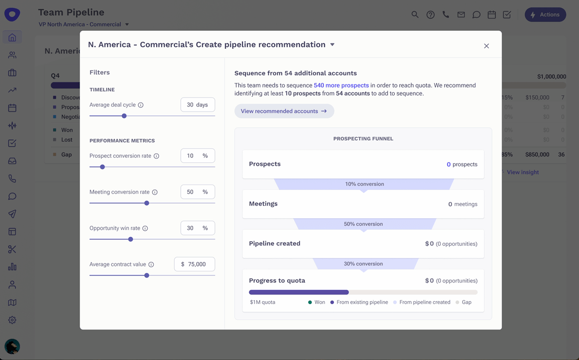
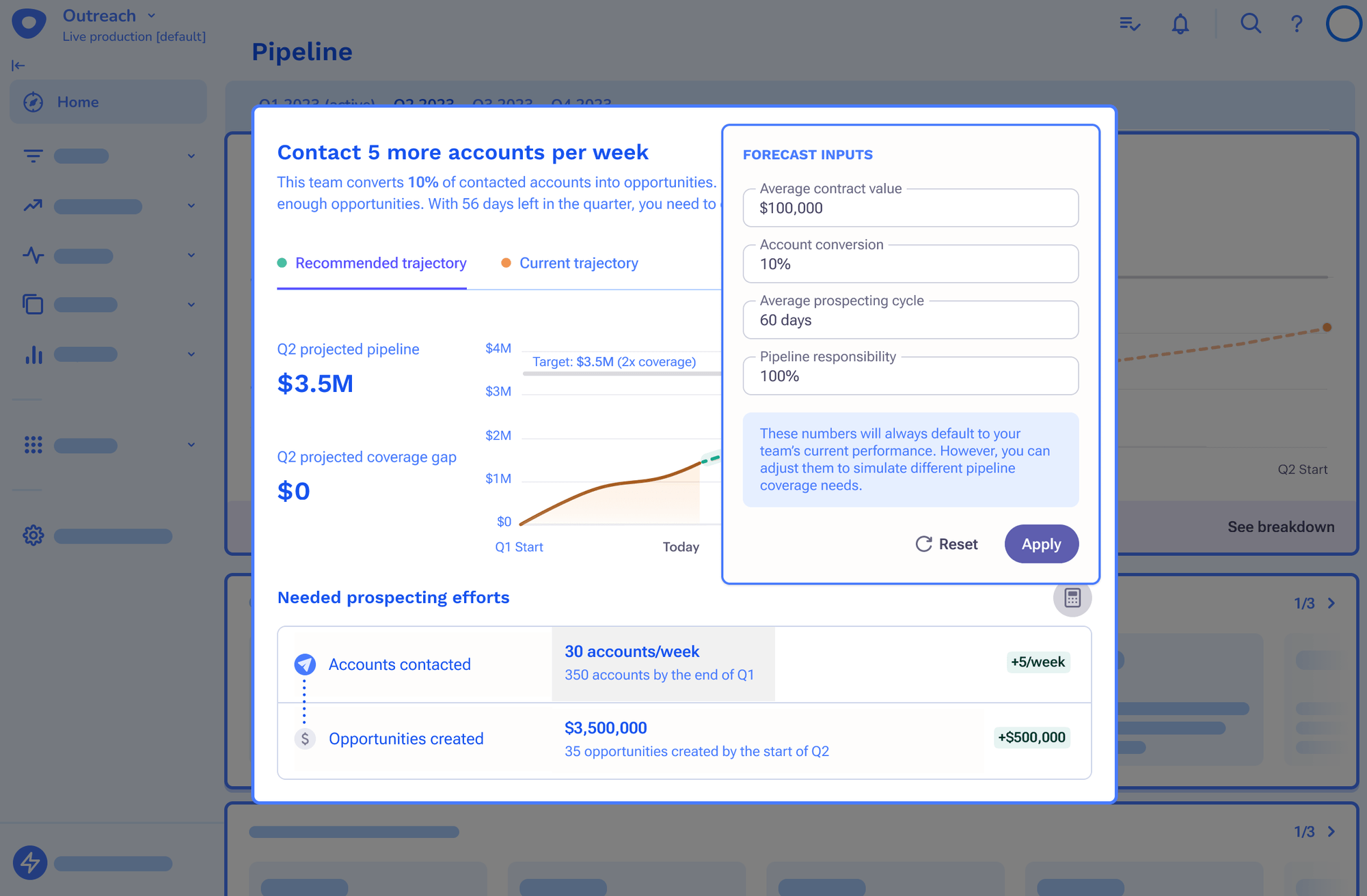
De-emphasizing the calculator functionality
I transformed the calculator functionality to be a pop-up from a button, de-emphasizing it but still remaining prominent on the screen.
Testing prototypes
Approach and insights
To validate the design, I partnered with User Experience Researchers (UXR) and conducted prototype testing with eight participants. The key questions addressed were:
- • Are the interactions discoverable and usable?
- • Are the data and data visualizations interpretable?
- • What opportunities for improvement exist?
Feedback from the testing revealed the following insights:
Iterating
Fitting into the new Deal Insights Dashboard
By this time, the Deal Intelligence team had defined the main pieces of the Deal Insights Dashboard. Since they decided that the overarching content of the page needed to be grounded in one quarter, I needed to brainstorm how to include multi-quarter viewability for our specific feature.
Individual cards for each future quarter
I considered creating a card that allows people to select a future quarter via a dropdown menu. However, I decided to make each future quarter a card of its own. This allows for easy scanning and less clicks to see important information.
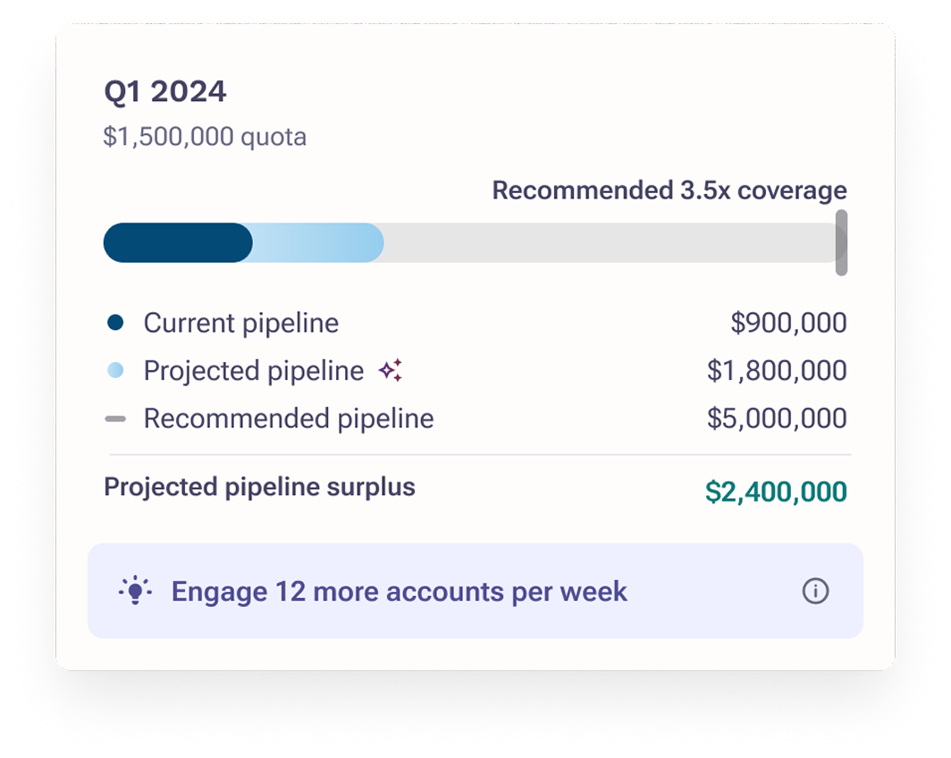
I placed them right beneath the current active quarter, so that the information of "quarterly pipeline" is grouped together on the dashboard.
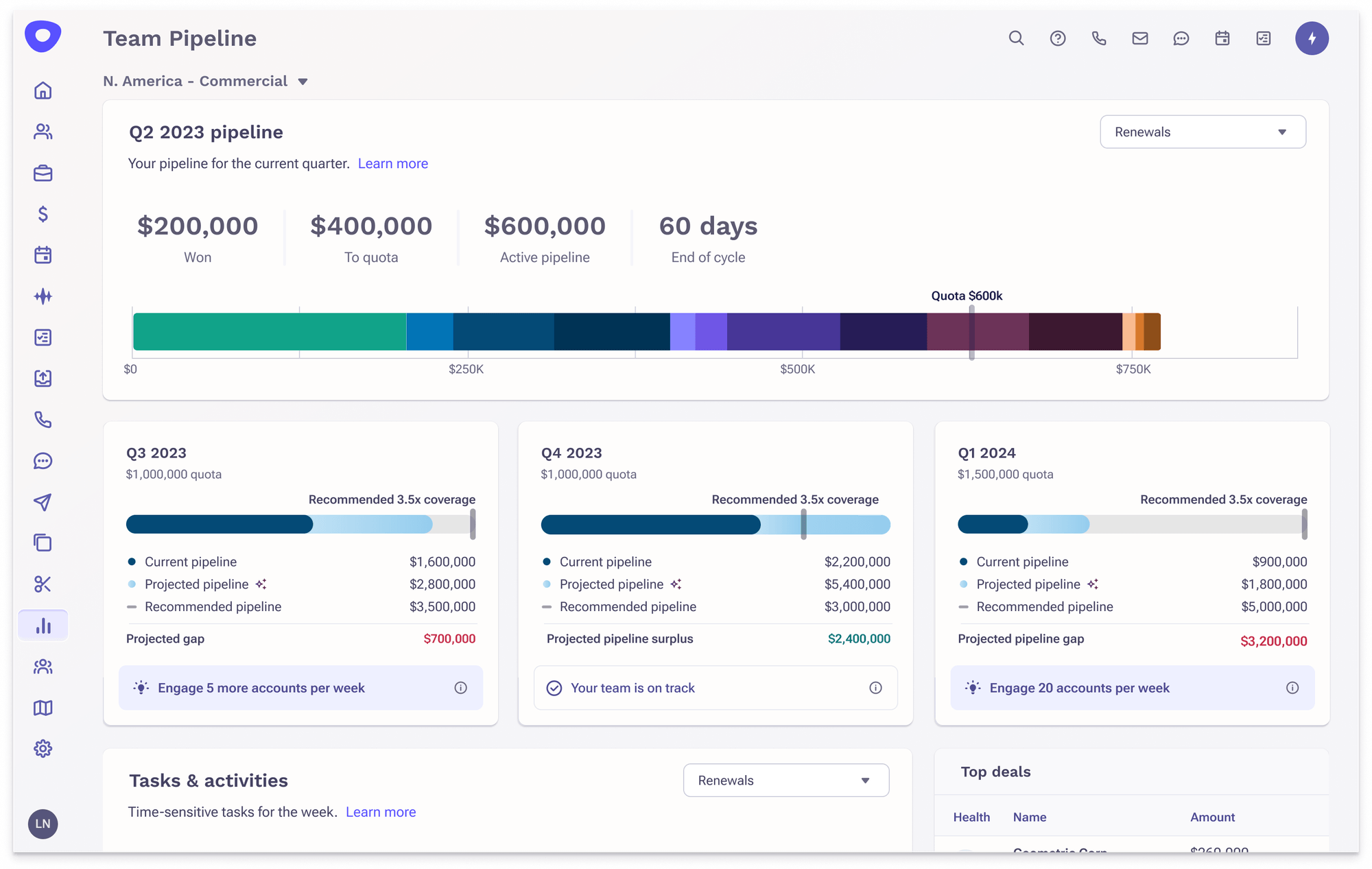
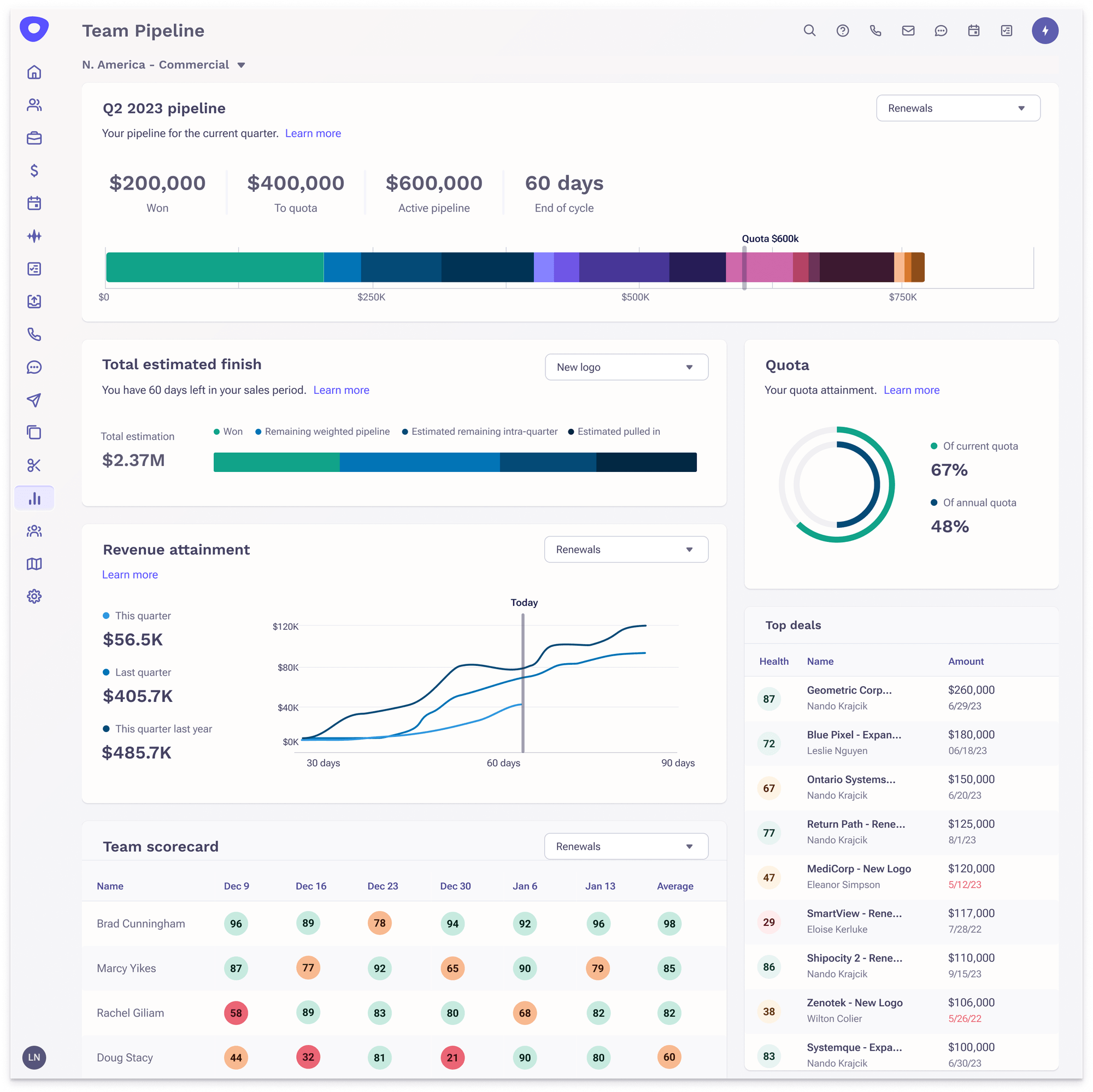
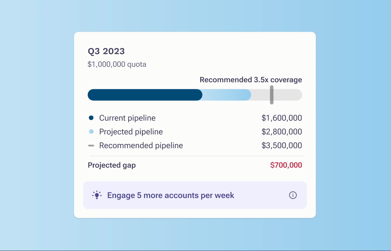
Switching from line chart to progress bar
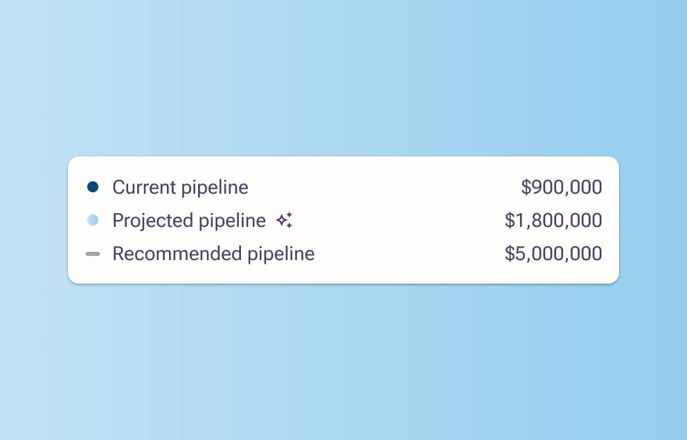
Utilized a progress bar so that progress towards a goal is clear without having to deal with strange time-based x-axes. Made the legend items vertical so that the numbers are easy to scan.
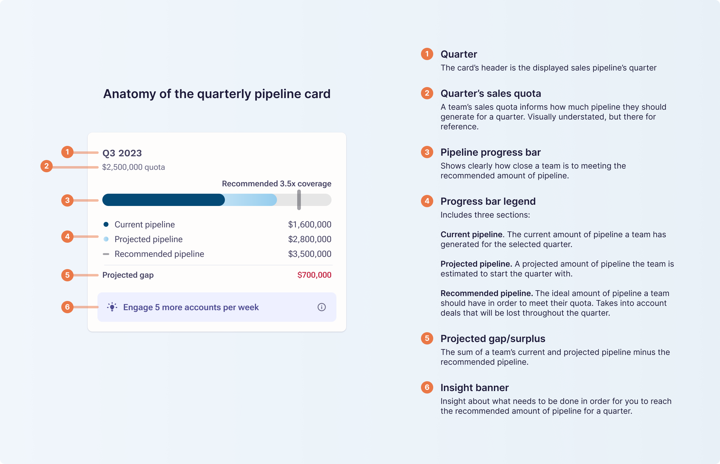
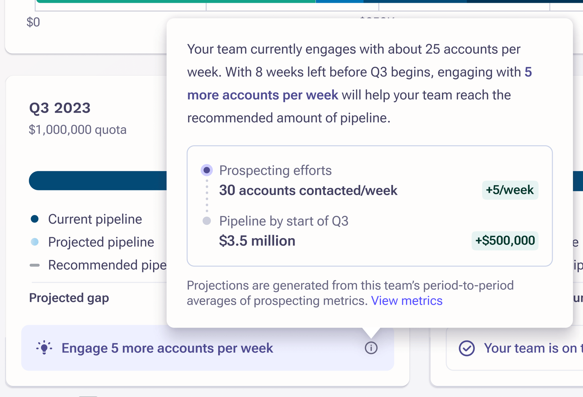
Recommended prospecting efforts
Each card has a static banner at the bottom that displays a high-level insight. To dig deeper, clicking the info tooltip exposes a popup that explains what prospecting efforts a team needs to close their pipeline gap.
For sales managers that want to simulate different prospecting needs, they can access the calculator via the "View metrics" button.
Designing different states for the insight banner
I defined three main types of insights: recommendation on how to improve, acknowledgment of being on track, and acknowledgement of exceeding your goal.
The "recommendation" purposely uses a "light bulb" icon and a filled background to draw the eye to that area. Conversely, the latter two insight banners do not have a filled background. This is so that color is used deliberately for important information that needs action.
Visually signaling the existence of AI
To denote that these projections are AI-based, the projected pipeline legend item is adorned with a "magic" icon.
Wrapping up
What's next
The project's timeline was extended due to organizational changes. Thus, Data Science and Engineering were set to complete their work a month after the initial deadline. After releasing to private beta, our next step is to implement the functionality of allowing managers to see their team member's contributions to the sales pipeline. We'll also be monitoring overall usage and potentially usability issues we'll need to address.